It’s Summer, And It’s Time To Get Into Form!

If you’ve been researching web design and all of the different ways that you can improve your site’s functionality, you’ve probably come across the word Form. Forms are generally referred to as the interactive section of a website, where visitors input the text or data themselves. Then, that data is sent up to you, the website’s administrator! Forms are essential to creating an audience for your site because they allow your visitors to interact with you in a way that’s standardized, simple, and straightforward.
The “Contact Us” Form
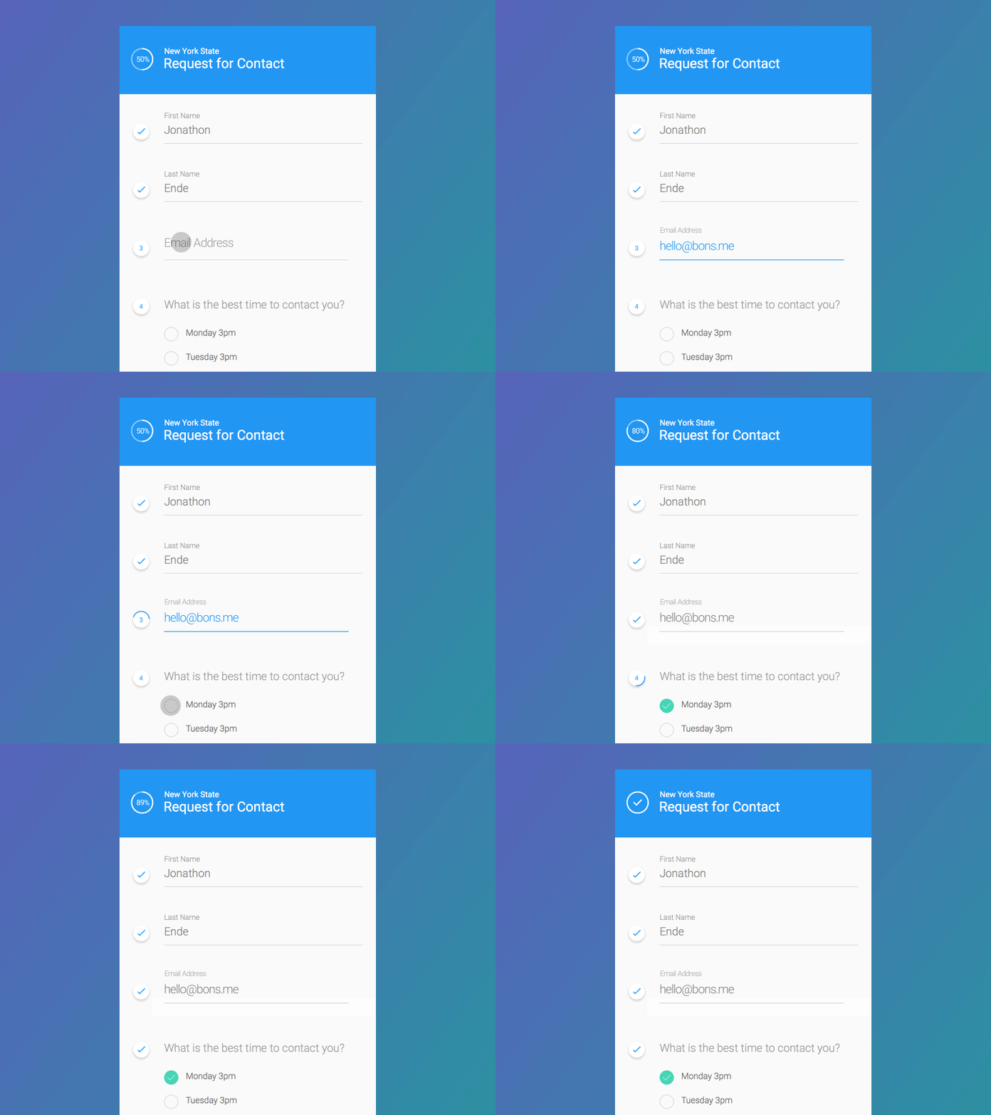
Still confused on what exactly forms do? Perhaps one of the most common examples of a form, and one you’ll find quite frequently on WordPress especially is the Contact Us Form.
In general, visitors enter in their own information, as well as their message, into the text boxes provided. After all “required” data has been entered, the form is submitted for the website owner to view. It’s a convenient and inviting way for your visitors to get in contact with you, as well as a classic example of utilizing Forms on your website.
The “Chat” Form
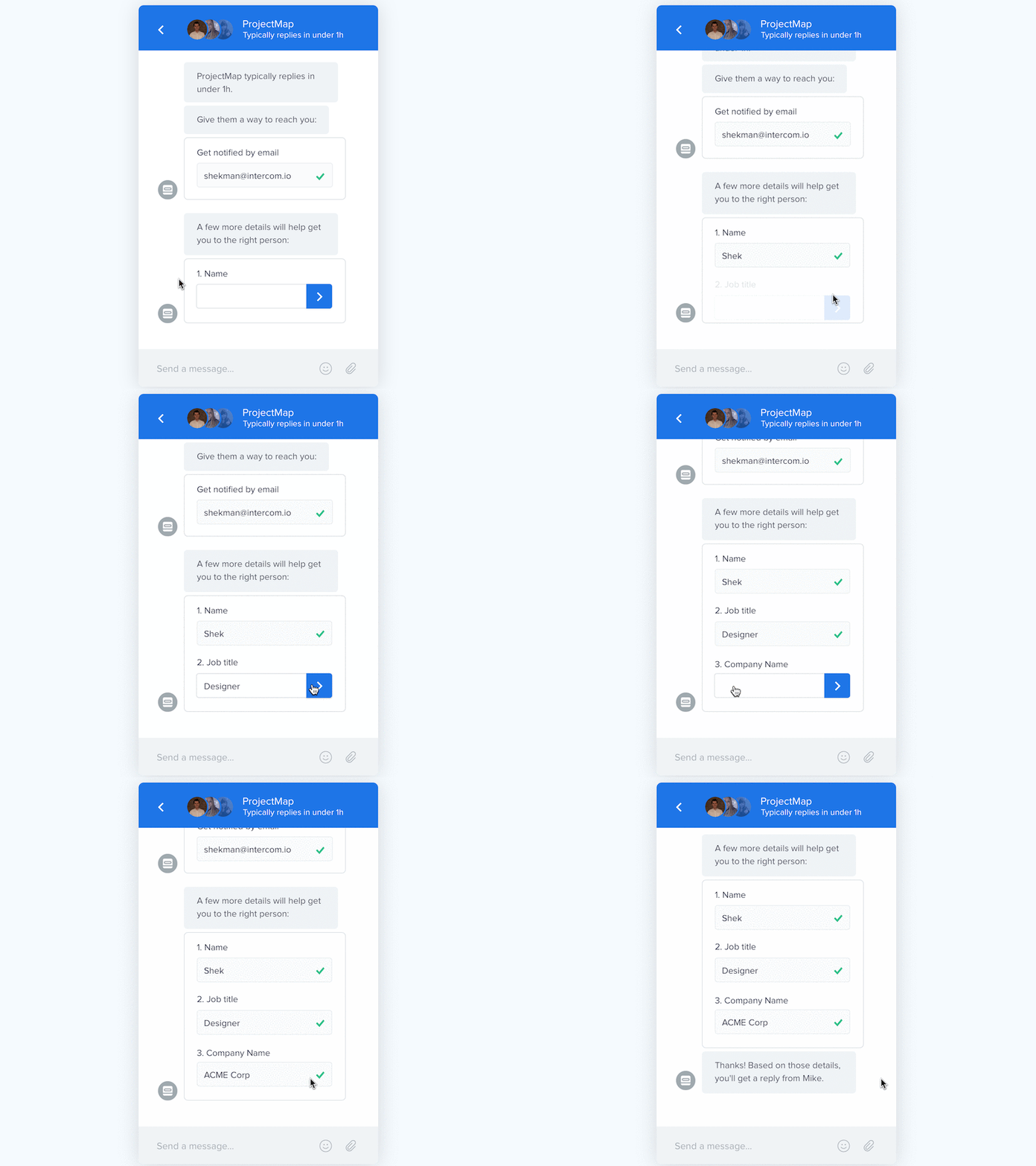
You’ve probably seen this one before. A Chat Form, which is a convenient way for your site visitors to get in contact with you quickly. Such a form is extremely popular with commercial sites in which visitors are interested in buying a good or service because it lets potential customers get help while shopping.
There are a couple of different ways to present a Chat Form as well. The preferred method is to have a representative be able to chat directly with your site visitor, as it creates the impression that you or your organization are always there to personally help your audience. However, sometimes that’s just not practical, especially if you’re running a small business where you may not be able to have someone there 24/7. This is where bots come in. In Chat Forms, bots can provide scripted answers, like redirecting site visitors to relevant articles to help them get the information they need.
The “Order” Form

Also referred to as a billing/shipping form, you fill these out every time you order a good or service online. Thus, Order Forms are absolutely necessary anytime money is exchanged because they allow the site visitor to input their payment method information, as well as their billing and shipping addresses. Order Forms aren’t so much optional ways to go about improving your website, as they are a pure necessity for all commercial sites. Without them, how would you have any customers!
The “Customer Feedback” Form
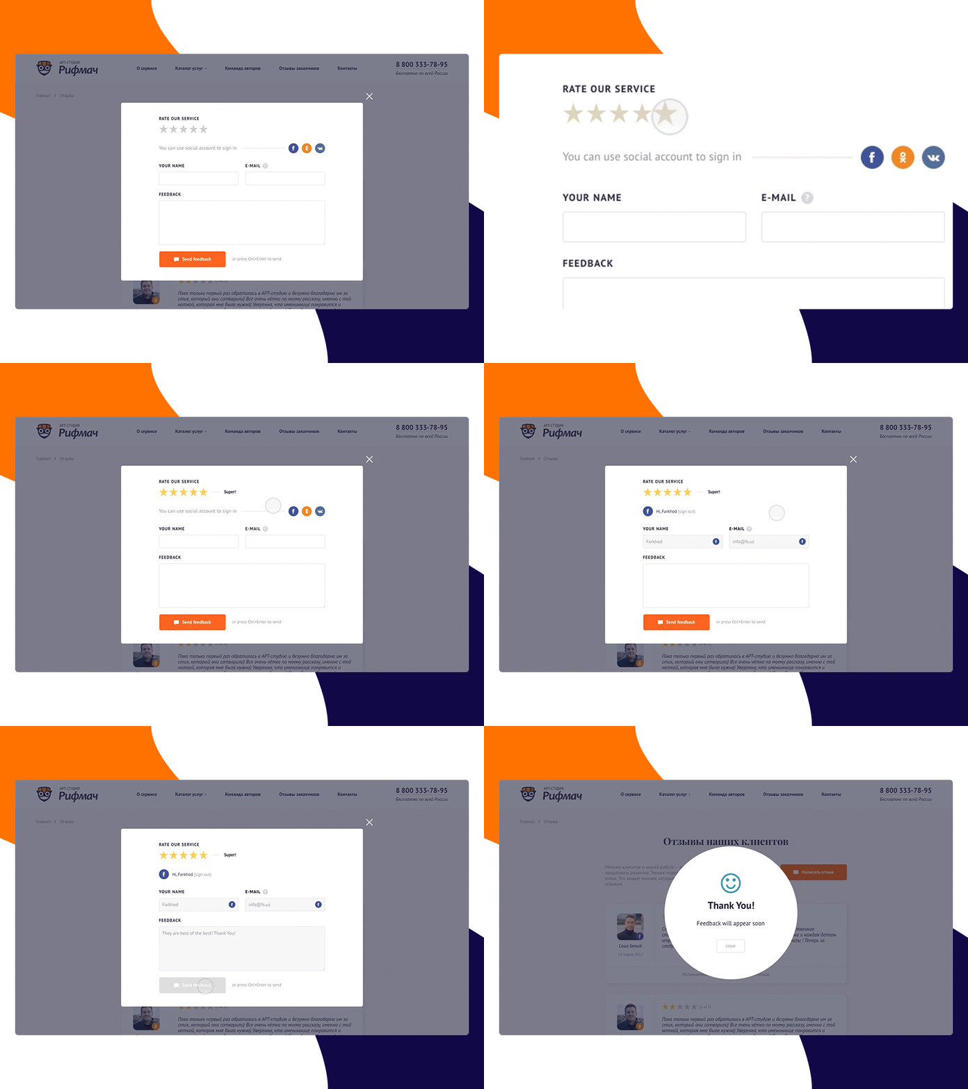
If you’re running a business-related site, having space for your customers to leave feedback, reviews, and/or testimonials is certainly an option. Publishing praise from real consumers is a powerful tool of persuasion, and the practice of having such a form on your site implies transparency as well.
The “Application” Form
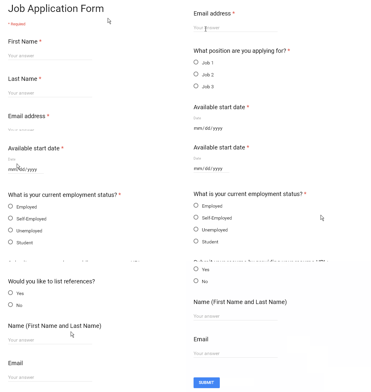
If your business is in the hiring process, having a form that allows you to submit applications can definitely help you filter applicants. Without a form for employee prospects, you’ll likely end up receiving emails from hundreds of job seekers, all using different formats and texts, and all providing different information. With a designated form for applications, you can set the parameters and requirements (Resume? Cover letter? Sample Work?), as well as have all of your applications submitted to you in a filtered, stylistically consistent manner.
The “Registration” Form
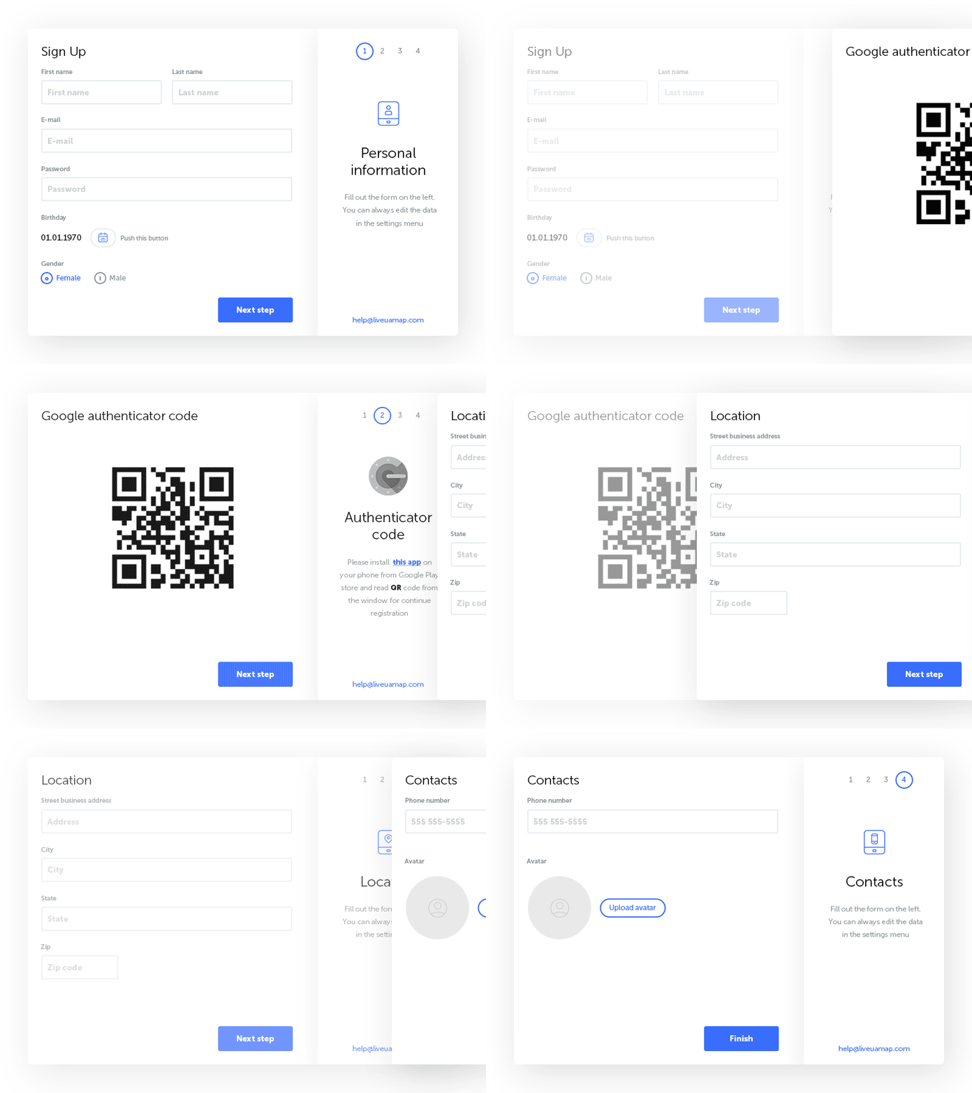
Registration is a pretty necessary step in most interactive sites. Need to add an administrator or contributor? They’ll probably need to register an account. Does your site have a public forum or comment section? Your visitors will need to register an account as well.
What if you’re offering a recurring service like a membership, or if you want to encourage raving fans by allowing repeat customers to create accounts on your site? Of course, you’ll need them to register an account. Just make sure that when you create a form for your registrations to not make the process too long, as you risk losing the interest of your site visitors.
The “Booking” Form
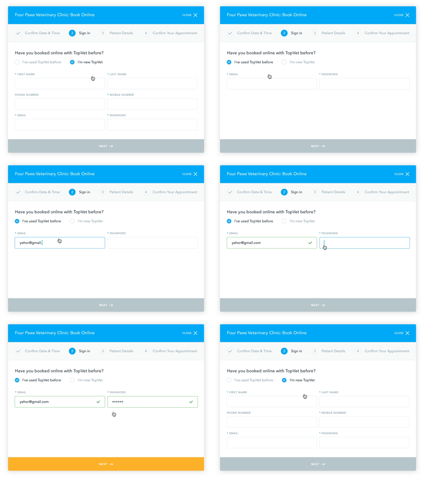
If you’ve ever had to coordinate an event, you probably already know how difficult scheduling can be. Booking Forms allow you to keep track of timeslots and appointments in a way that avoids the usual chaos while saving you time by having your site visitors do all the work. Also, because you get to limit options and block off availability, it helps prevent your scheduling from being too open-ended.
In Conclusion…
Simply put, forms are the essence of allowing your site visitors to interact with you and your website in a way that is logical and useful. The opportunities are endless. You set the parameters, you set the rules, and you use the data provided to you by your audience to create a better website, blog, company, business, organization—whatever! Forms are about convenience and functionality, and the better you understand them, the better your website will be.

Matthew Bishop
Matthew is the blog editor for the HackerPress Blog. He is an aspiring music journalist and PR manager. In his spare time, he enjoys practicing jazz guitar and fitness training.


